Week 1: Just begun and already too late
Hello everybody!
Starting right now, I'll be posting an update of this game's development every week from now on until forever.
But, alas, it's the end of the second week already and I havn't done anything yet! So instead, let's size up the current situation.
Let's run the current build of Skullz 'n Skeletonz.

Hi, that's me. This logo used to have half the resolution and a plain old white text, it also used to read Pizzamakesgames. I'm not happy with this revamped version yet, and it still does the engine fade to black which I've gotten rid of for most of the rest of the game.

The pizza is followed by an illegible title screen that is way too dark and missing an important asset that would normally be looming in the distance. Technically, this screen was already finished at one point, at which it looked like this:

The old version is much more legible, not only in regards to the text, but just wasn't a powerful enough first impression (also a technical nightmare, look at those fades), so forgive me for feeling the need to work on this a bunch still, but I'm excited to get this particular screen into a state that'll make the player want to dive right in from the very first second.
We choose the new game option and...
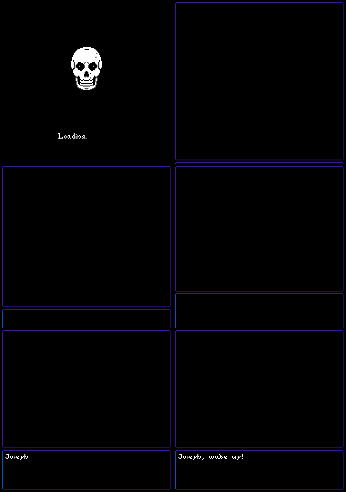
We get a broken loading screen followed by the start of the first scene that I'm gonna keep a secret since it's something I don't wanna spoil. That blue line in the lower left is due to me having haphazardly hacked in the inventory recently without accounting for changing palettes yet.

Next up is this scene in which I'm trying to give a big contrast to the previous hectic mess I didn't just show you while also driving you to do something by the screen shaking and the sound crunching rhytmically, hopefully enticing you to figure out what's happening. This is the first scene I'm basically completely happy with. I changed the way these responses are written after reading a good book recently and hoped they would give a nice contrast to the casual talk the main character is using. You'll see in a sec.

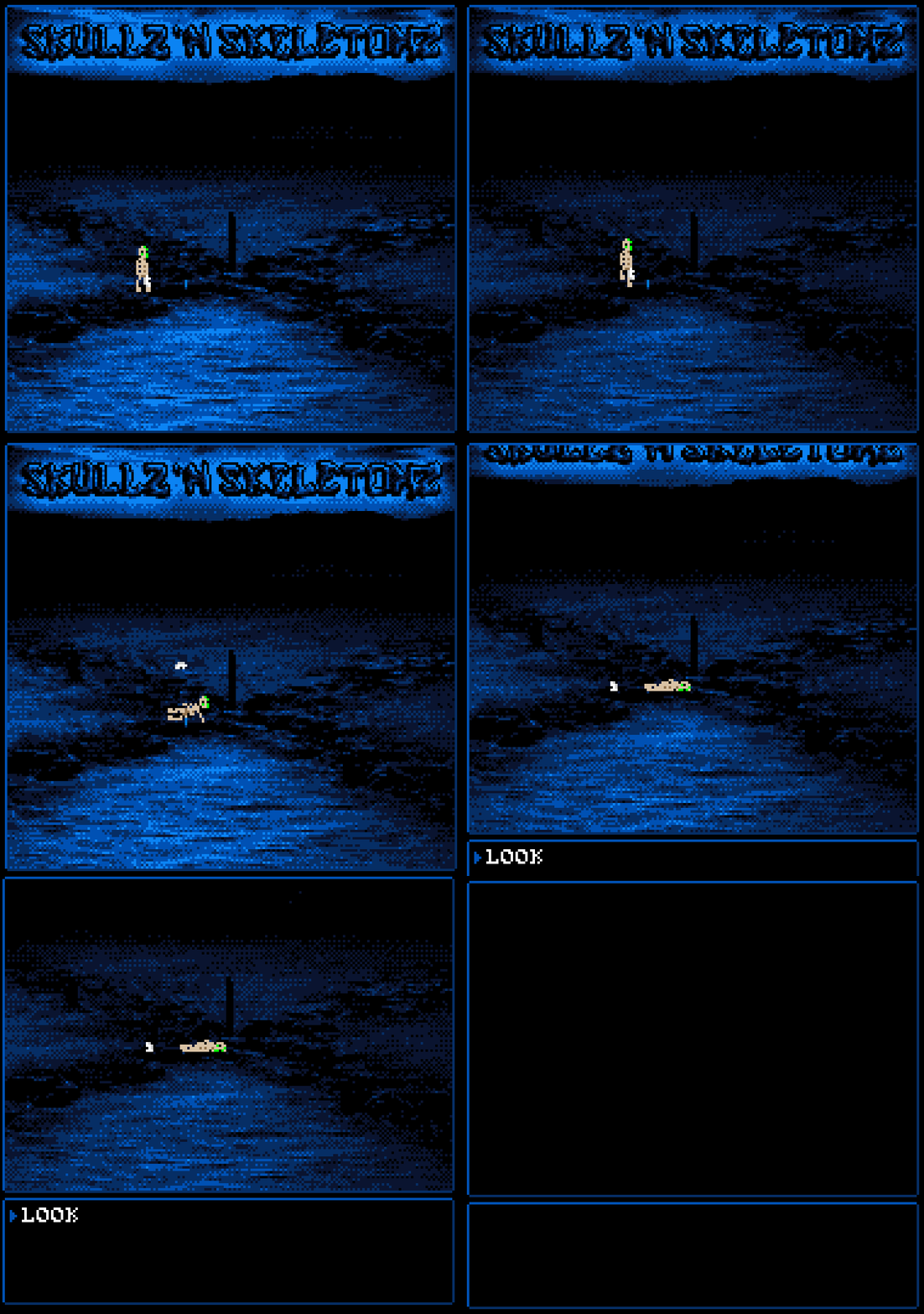
You'll get a little intro movie after you've got through some dialogue in the previous scene. This is one of 4 shots, and probably the only one I need to change something about still. You see, that skull you play as is called Joseph, but there's some great potential for immersion if the player were to pick his own name which I don't wanna miss out on, so that text is gonna change from "Joseph" to "yourself" eventually. The name is still gonna default to Joseph if you wanna go all like "I'm not gonna be renaming the main characters" on me.
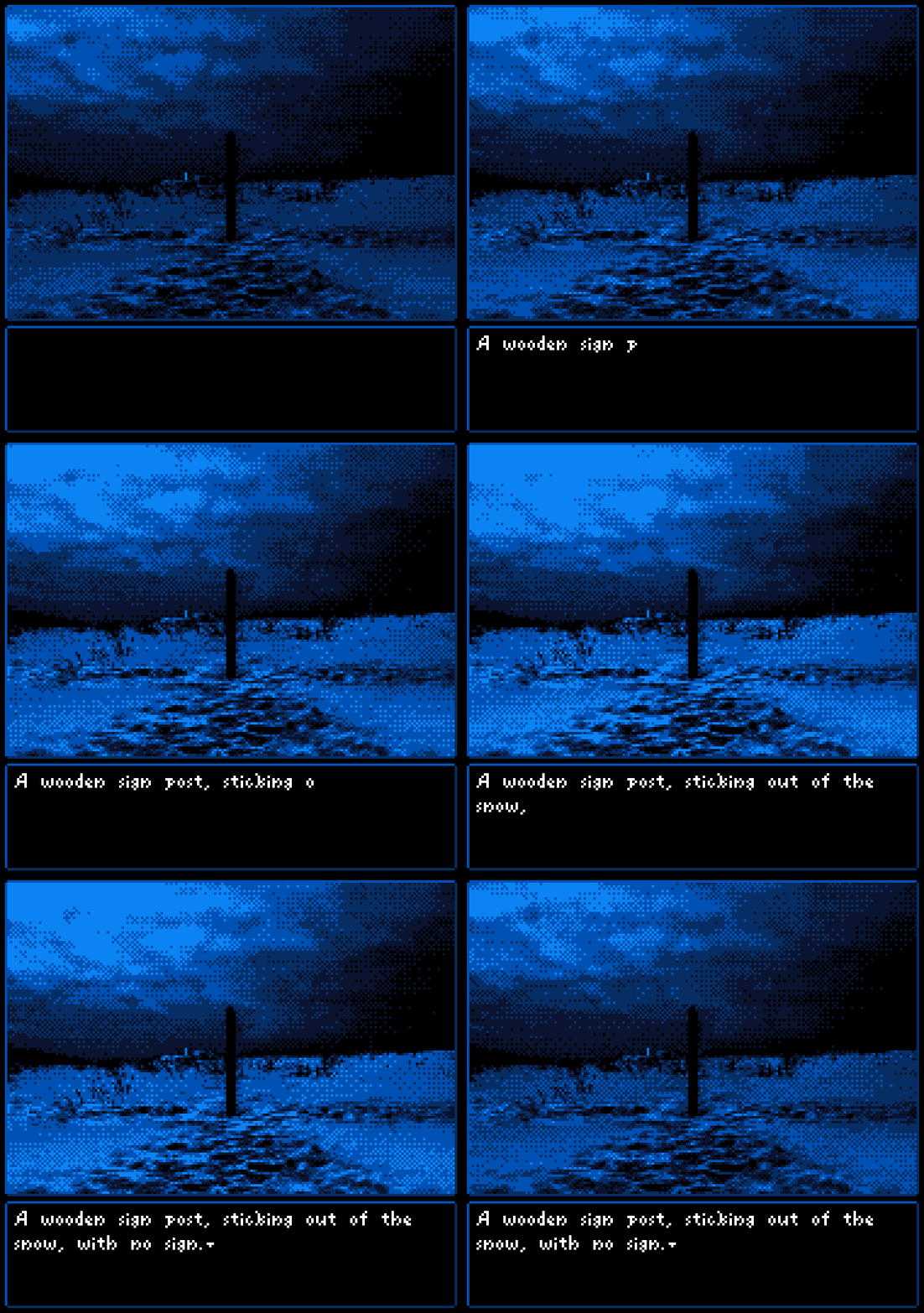
This is the big one. The first scene to give you full control as well as the last shot of the intro cutscene. Your adventure starts here, and I've been stuck on this scene for a while, using it as a playground to try out a lot of different ways for the player to interact with the game.
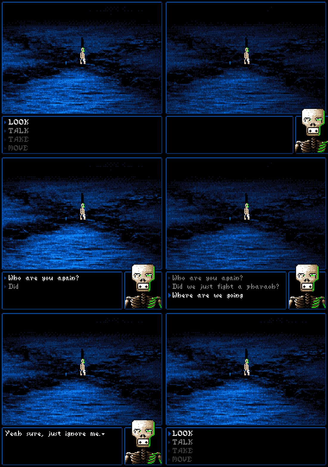
Once I'm completely happy with this scene and determined a satisfying way to interact with everything in it, and with that, the entire game, every scene after will be as easy to create as if I was playing the game myself, and I'm real close to be done with that.
That's it for this one. The next entry is due today already, so I'll probably continue this with another post of all the scenes that already exist but aren't connected to the gameplay loop yet, of which there are a lot, and then we're off to new adventures. Let's get this game made!
Skullz 'n Skeletonz
The sequel to Skullz. Release Date TBD
| Status | In development |
| Author | Pizzamakesgames |
| Genre | Adventure |
| Tags | Surreal |
More posts
- Week 2: Sizing up the situation some moreJan 14, 2018
Leave a comment
Log in with itch.io to leave a comment.